ROLE
UX/UI Designer
Web Developer
TEAM
Design Team, MES Team, ERP Team, MII Team, PCo Team
TOOL
Figma, FigJam, Miro, Adobe Creative Suite, Jira
DURATION
5 months
IMPACT

80%
Operator Task Success Rate

1min
Issue Response Time

30%
Equipment Uptime

90%
Configuration Time
01 - The Challenge

A Production Line Falls Behind Schedule
A supervisor needs to figure out why.
Is it a machine issue?
A material shortage?
Workforce availability?
Or the production schedule itself?
The information exists—but it's distributed across different parts of the platform and connected systems. As a result, supervisors struggled to maintain context and understand what to do next.
PAIN POINTS

Fragmented workflows & data

Weak prioritization of issues

Limited visibility & guidance

Poor shopfloor usability
The challenge wasn't finding more data. It was connecting the data that already existed.

The Project
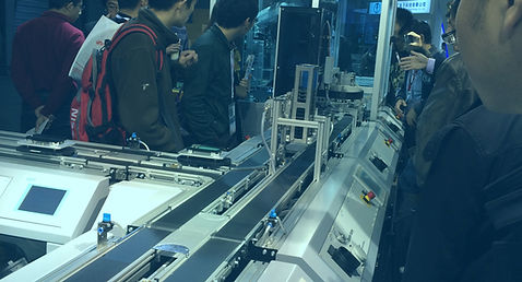
This was the challenge behind a Smart Manufacturing platform I worked on for the China International Industry Fair, developed as part of an Industry 4.0 showcase with the Chinese Academy of Sciences.
The platform connected the manufacturing lifecycle—from customer orders and production planning to shop-floor execution.
MY ROLE
I worked as a Product Designer responsible for the production operations experience within the broader Smart Manufacturing platform, including the Supervisor Overview, Machine Status, Production Order, Work Order, and Alert Management experiences.


Research
The platform served three main user groups:
-
Customers placed customized vehicle orders and needed visibility into their order and production status.
-
Production supervisors monitored overall production, managed orders and alerts, and coordinated responses to issues across the shop floor.
-
Operators worked directly with production tasks, work orders, and equipment on the shop floor.


RESEARCH STEPS
For this project, I structured my research around users, behaviors, the existing system, and the decisions they needed to make.


What I Learned
KEY INSIGHTS
01 — Users think in decisions, not modules
Different roles needed different levels of information and decision support. The experience needed to prioritize what each user needed to know and do.
→ Understandable
02 — Decisions cross system boundaries
Production decisions often required information from multiple modules and systems. Users needed to maintain context as they moved between workflows.
→ Predictable
03 — The system needed to scale with manufacturing capabilities
As more capabilities were connected, inconsistent information, actions, and system states made the experience harder to extend. Reusable patterns were needed so users could transfer what they learned across workflows.
→ Extensible
THE REAL CHALLENGE
"How might we make a complex manufacturing system understandable, predictable, and extensible?"
02 - Seeing the System

Map the Complexity
Before redesigning the experience, I mapped the system to understand where information came from, how it moved across systems, and who depended on it to make decisions.
Mapped from:
Stakeholder interviews · Workflow analysis · Existing product architecture · SAP / ERP documentation · Manufacturing domain knowledge

System Map
KEY INSIGHT
The complexity wasn't just in the number of modules. It came from the relationships between systems, workflows, and users.
Understand the work
To understand how the system actually supported work, I mapped the workflows and decisions behind each user role.
I focused on the supervisor as the key decision-maker, whose work connected monitoring, investigation, and action across multiple modules.

User Decision Workflows
-
Supervisor: Monitor → Prioritize → Diagnose → Decide → Verify
-
Planner: Plan → Allocate → Monitor → Adjust
-
Operator: Receive → Execute → Report → Resolve
-
Engineer / Maintenance: Detect → Diagnose → Resolve → Verify
-
Customer: Order → Track → Receive
Supervisor Workflow

Supervisor Journey Map
KEY INSIGHT
Comparing user decision workflows revealed a common pattern across the MES:
Understand the current state → Identify what needs attention → Take action → Verify the outcome
Reframe the Structure
The existing system was organized around modules.
Production, equipment, quality, and orders each had their own place in the system.
But people didn’t work in modules. They worked across decisions.
I reorganized the information architecture around the common decision pattern—bringing related information and actions together across system boundaries.


03 - Design for Decisions
Challenge 01
Signal Overload Without Action Hierarchy

EXPLORATION
Firstly, I needed to understand the core information needed in the production dashboard. So I explored different views across production, quality, equipment, and workforce.

Workforce focused

Quality focused

Production focused

Machines focused
DECISION
I initially explored using a dropdown to switch between separate production, quality, equipment, and workforce views. While this provided flexibility, it also required users to repeatedly change context and increased interaction cost.
I ultimately chose a unified overview that brought the most important information into one experience, while using hierarchy and progressive disclosure to provide deeper detail when needed.
The trade-off was giving up some degree of view-level customization in favor of a simpler mental model and stronger situational awareness.
DESIGN

Unified Production Overview
EXPLORATION
With dashboard content defined, I structured the information hierarchy to surface critical data first, followed by secondary and supporting details. This aligned with natural user scanning behavior to improve clarity, speed, and decision-making.
I faced a challenge in emphasizing the Alerts card while balancing the dashboard’s overall clarity and contextual relationships. I explored multiple solutions, including alert-first placement, top banner, floating badge, expandable drawer, and enhanced contextual card.

Floating alert badge

Floating alert badge


Alert drawer
Enhanced alert card

Alert banner

Alert-focused
DECISION
Through workflow analysis and prototype reviews with production stakeholders, I evaluated how quickly users could recognize an issue, understand what it was related to. The reviews showed that separating alerts into a dedicated layer made them more prominent, but also added interaction steps and weakened their connection to the affected equipment or work orders.
I ultimately enhanced the existing contextual alert pattern rather than introducing a separate alert layer. This allowed critical issues to receive stronger visual emphasis while preserving their relationship to the affected equipment, work orders and avoiding additional interaction overhead.
The trade-off was between making alerts more prominent and keeping them connected to the context where action happens.
DESIGN
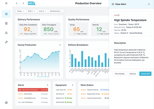
Enhanced alert card

Information Hierarchy
Progressive Disclosure
Challenge 02
Inconsistent Context Undermining User Trust
EXPLORATION
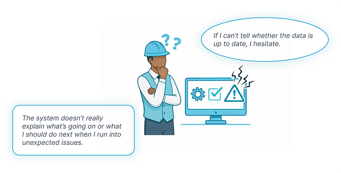
I designed predictable system behaviors and feedback across different operational states, helping users understand what the system was doing, where production stood, and whether the information could be trusted—so they could make confident decisions.
I started by designing multiple fallback strategies to handle or prevent unexpected user issues, including safeguards against accidental actions, autosave with undo functionality, role-based permissions, and inline error guidance.
DESIGN
Safeguards against accidental actions
EXPLORATION
After addressing user-triggered issues, I shifted focus to system-triggered scenarios. Using the supervisor workflow, I mapped key interactions to identify edge cases where system behavior could become unclear or inconsistent.
Edge Cases
-
Data reliability issues — missing or conflicting data across dashboards, production orders, and work orders.
-
Action availability issues — disabled actions (e.g., unavailable work order creation).
-
Form validation issues — incomplete or invalid work order inputs.
-
System failure scenarios — failed save actions and unexpected system errors.
I defined corresponding system responses for critical edge cases to help supervisors navigate failures more reliably. This included resilient error handling for failed work order saves (preserving input, preventing duplication, and enabling recovery) and graceful degradation for missing dashboard data (preserving context, surfacing status, and maintaining visibility).
DESIGN
Designing resilient save flows for network or system errors
EXPLORATION
In a real-time production environment, trust depends on clear and predictable system feedback. I defined consistent state changes across components, pages, and system statuses to communicate data freshness, reduce ambiguity, and support faster decision-making.


Icon + Color
Text + Color
Icon + Color + Shape + Text
DECISION
In a manufacturing environment, operators and supervisors often work under time pressure, varying lighting conditions, and different levels of system familiarity. Through workflow analysis and prototype reviews, I evaluated how quickly users could recognize production status and distinguish between different states.
The reviews showed that relying on color / text / icon alone made status harder to recognize at a glance, especially when users were scanning dense operational screens. I therefore designed a multi-cue badge system that combines icon, color, shape, and text, giving each status multiple visual signals.
This made status information more immediately recognizable and accessible across different working conditions and levels of system familiarity.
The trade-off was between visual simplicity and redundant cues for fast, reliable recognition.
DESIGN

Production Overview — Status at a Glance

Production Orders — Status at a Glance
Challenge 03
System Consistency Across Technical Differences

CONFLICT
I wanted users to experience the platform as one coherent system, with predictable navigation, feedback, and interaction patterns across modules.
Engineers, however, pointed out that different data sources, dependencies, and transaction states meant that forcing the same behavior everywhere could be technically unrealistic—and could misrepresent what the system was actually doing.
EXPLORATION
I mapped common interaction patterns across modules and worked with engineers to identify where behaviors could be standardized without ignoring technical constraints. I evaluated navigation, loading and error feedback, filtering, drill-downs, status display, and context preservation.
Keep consistent
Navigation
Context
Interaction patterns
Visual language
Feedback structure
Adapt
Data behavior
System dependencies
Available actions
Transaction states
Confirmation & recovery
DECISION
I standardized behaviors where the user's mental model and task were the same, while allowing flexibility when the consequences of an action were different.
This created reusable interaction patterns with flexibility where it mattered, helping users transfer what they learned across modules without forcing technically unrealistic behavior.
The trade-off was between interaction consistency and flexibility for different technical and operational contexts.
DESIGN
Work Order — Direct Block
Production Order — Authorized Block
04 - Turning Complexity into a Story
The system was complex.
The experience didn't have to be.
E-commerce Platform
I designed mockups for the first stage of the Smart Manufacturing showcase—a vehicle customization and ordering experience that turns a range of options into a clear, intuitive customer journey, from configuration to order placement.

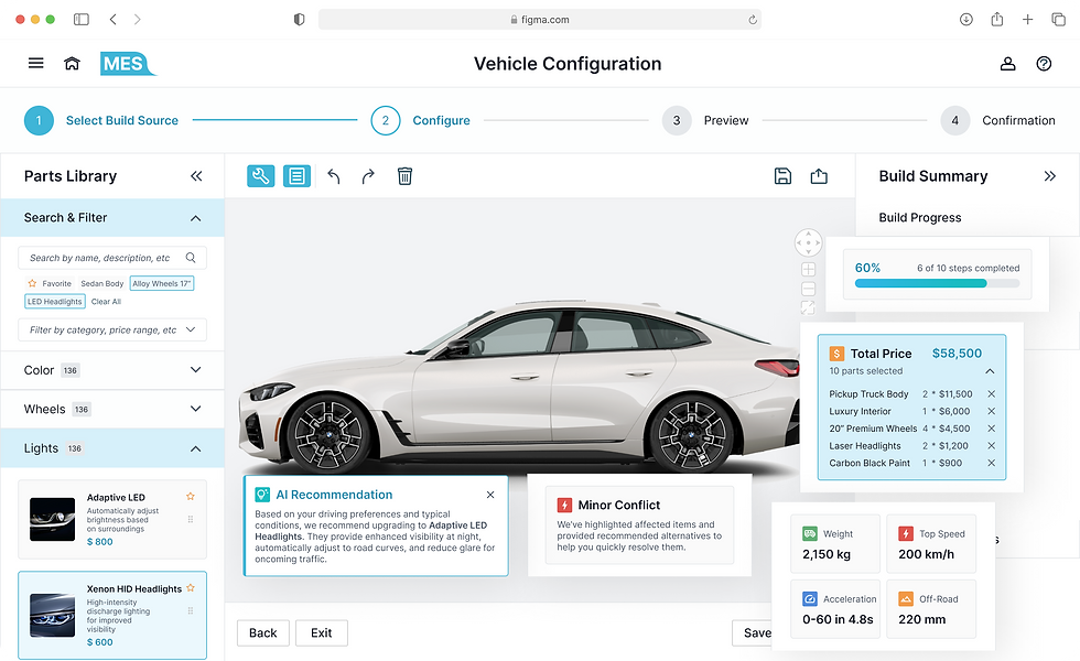

Hover to slide through
Intelligent Production Management System
I designed prototypes for the Intelligent Production Management System, the production stage of the Smart Manufacturing showcase. The interface turns real-time production data and emerging issues into a clear decision-making experience, helping supervisors and operators quickly understand what is happening, what needs attention, and what to do next.
ACT FAST, STAY IN CONTROL
Supervisors instantly spot critical issues and take action with clear priorities, real-time alerts, and minimal cognitive load.
SEE THE FULL PICTURE, DECIDE CONFIDENTLY
Supervisors dive into connected data and production context to understand root causes and make informed, end-to-end decisions.
KNOW WHAT MATTERS, DO IT RIGHT
Operators access the right context at the right time—machine status, instructions, and alerts—so they can act confidently and accurately on the floor.
05 - The Outcome
Impact

Reflection
Design from the workflow outward. Turn complex system logic into experiences users can understand and act on.
Connect the system, not just the screens. Align information, workflows, behaviors, and patterns across interconnected enterprise processes.
Think deeply, move quickly. Validate structure early, iterate faster, and get closer to real user feedback.
Disclaimer: The visuals in this case study are recreated simulations designed to demonstrate the design process and key improvements. Due to confidentiality agreements, no original content from the live product is shown.