Overview
At SAP, we designed Central Design Time, a cloud platform that bridges ERP-defined routings with shop-floor execution, creating a more seamless, end-to-end production modeling and orchestration experience.
Role
-
UX/UI Designer
-
Web Developer
Team
Design Team, MES Team, ERP Team, MII Team, PCo Team
Tools
Figma, FigJam, Miro, Axure RP, Adobe Creative Suite, Jira
Details
-
Duration: 9 months
-
Company: SAP
My Role
-
Defined end-to-end system structure by mapping cross-role workflows and organizing complex production logic into a scalable framework.
-
Designed multi-level interaction patterns, including drill-up/down navigation and consistent layouts, to support different levels of abstraction.
-
Explored and refined key system behaviors such as error handling, dependency tracing, and visibility, aligning user needs with technical constraints.

Impact
What we achieved with CDT
The CDT MVP was released as a beta to key customers to validate its end-to-end production design approach. The results were strongly positive, with increased customer demand and higher engagement and success rates in completing production workflows, confirming CDT’s ability to simplify complex ERP–MES interactions into a more intuitive, connected experience.
70%
System Adoption Rate
-40%
Routing Error Rate
4/5
User Satisfaction Score
80%
Successful Deployment Rate

Discover
How fragmented workflows created complexity
Background
The routing is the top level of process modeling, which defines the sequence of operations required to manufacture a product. It’s like a recipe or blueprint that tells the system how to make something, where to do it, and in what order.
Target User
To apply routings from ERP to the shop floor level interactions involves two roles: Routing Planner and Technical Engineer.

Goal
Own defining and managing production routings in the ERP system

Goal
Implement and maintain detailed shop-floor execution logic in PLC systems
Before CDT, the routing planner managed routings within the ERP system. Typically, a routing did not include detailed operational sequences—these were usually hard-coded directly into the PLCs at the shop-floor level. Whenever interactions between machine units were required or when the production environment changed, a technical planner had to manually update the PLC code each time.

Fragmented ERP-to-Shop-Floor Routing Workflow
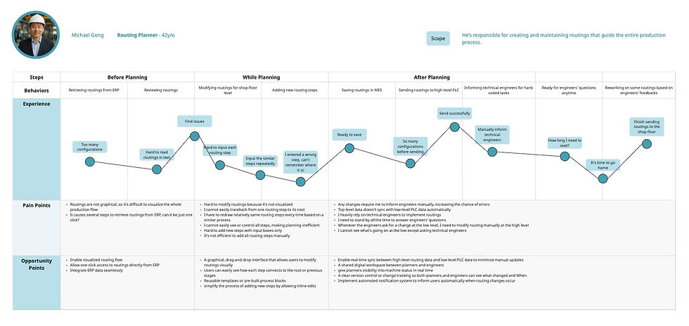
User Research
We conducted interviews with 21 participants — including 7 routing planners, 10 technical planners, and 4 first-time users. All interviews were held on-site at the local factory.
We used affinity mapping to organize interview insights and uncover common patterns and pain points. Based on these insights, we created user personas to represent key user groups and their needs. We then mapped the end-to-end user journey to visualize workflows, handoffs, and opportunities for improvement.
-
Affinity Mapping


-
User Persona


Hover to slide through
-
User Journey Mapping

Hover to slide through
Pain Points
We mapped insights through affinity diagrams, personas, and user journeys to uncover deeper patterns. This showed us where breakdowns consistently occurred and where opportunities for improvement existed.
Routing Planner
-
No direct link between ERP routings and shop-floor execution
-
Limited visibility into real production execution
-
Lack of intuitive or visual tools makes routing creation and maintenance inefficient and error-prone
Technical Engineer
-
Must repeatedly hard-code or update PLC logic for routing changes
-
High dependency on engineering effort for execution-level changes
-
No reusable templates or standardized logic
Define
What we uncovered across roles and systems

Key Insight
User struggles with a fragmented routing workflow where ERP-based planning is disconnected from PLC-level execution, requiring constant manual translation and coordination between routing planners and technical engineers.
As a result, production changes become slow and error-prone, with limited visibility across systems, repetitive engineering effort, and a heavy reliance on technical expertise to keep processes aligned.

Design Decision
So we decided to design a centralized production modeling system that unifies routing, validation, and deployment into a single workflow with shared workspaces and a standardized data model.
We also introduced a new role, the Operational Planner, responsible for translating high-level routings into detailed operational steps and connecting the necessary equipment within CDT. This role separation helps reduce complexity, improve collaboration, and lower the technical barrier across teams.

Project Goals
Goal 1
Design a visual flow editor that enables intuitive, graphical configuration of production workflows
Goal 3
Provide reusable and testable workflow capabilities, allowing users to duplicate routing operations and validate processes through offline simulation
Goal 2
Create a centralized production management system that unifies routing, validation, and deployment
Goal 4
Build an integrated monitoring dashboard that delivers synchronized, real-time visibility into routing progress and machine status across the production system
MVP Goals
Design Decision
Due to tight development timelines and limited engineering resources, we prioritized MVP features that directly support the core production modeling workflow.
We focused the MVP on creating a centralized management system and a visual flow editor, enabling users to define, configure, and understand routing processes in a unified and intuitive way.
Goals related to reusable workflows and integrated monitoring were deprioritized for the MVP, as they required deeper system integration and were not essential for validating the core end-to-end routing design.
Design
How we began structuring a unified system
Information Architecture & Workflow Design
-
Sitemap
To ensure a clear information architecture, we first created a sitemap to define the overall structure of the CDT application. The sitemap helps visualize how different sections—such as projects, flows, and machines—are organized and connected, establishing a foundation for intuitive navigation and scalable design.
.jpg)
-
User Flow
To ground the design in real production workflows, I created three simple cases—one for each key role: routing planner, operational planner (newly added), and technical engineer.
-
Case 1: With routings defined in the ERP system, the routing planner creates a new project in CDT, imports the routings, and assigns the project to an operational planner.
-
Case 2: The operational planner translates the routings into detailed operational and communication flows, then marks them as complete and hands off the project to a technical engineer.
-
Case 3: The technical engineer finalizes the implementation by configuring message flows and completes the workflow for deployment.

Case 1: The routing planner creates a new project and assigns to a operation planner

Case 2: The operation planner designs communication flow and operational flows, and marks the flows as completed

Case 3: The technical planner designs message flows, and marks the flows as completed
-
Cross-Functional Swimlane Diagram (current vs. future)
Building on the individual user flows, I mapped the end-to-end process using cross-functional swimlane diagrams (current vs. future) to visualize how the three roles—routing planner, operational planner, and technical engineer—collaborate across systems. This helped clarify how responsibilities and data flow between ERP, CDT, and shop-floor execution, and identify breakdowns in coordination, visibility, and decision-making.

Current flow without CDT

Future flow with CDT
Key Insight
-
Responsibilities are fragmented across roles and systems, leading to frequent handoff friction
-
Critical workflow logic is split between ERP and PLC layers, requiring manual translation
-
Limited visibility across stages makes it difficult to track progress and diagnose issues
-
High dependency on technical engineers slows iteration and increases coordination overhead
Design Decision
Based on the swimlane analysis, we defined an information architecture that connects routing planning, refinement, and deployment into a unified end-to-end workflow, reducing fragmentation across roles and systems.
We introduced a shared workspace concept to support cross-role collaboration and alignment throughout the process.
To improve clarity and system understanding, we designed drill-up and drill-down navigation between high-level routings and detailed operational flows.
Core Challenge
Making Complex Production Systems Understandable Across Roles

Key Insight
Users work at different levels of abstraction, but the system does not clearly support switching between end-to-end visibility and detailed execution. This creates difficulty in maintaining context across roles, leading to fragmented understanding and cognitive overload when navigating complex workflows.
-
Unify Core Information Structure across Roles
I took charge of addressing this challenge by defining a consistent data model and layout system across routing, operational flows, and message flows. Firstly, I standardized key interaction patterns such as list structures, editor layouts, and hierarchy logic so that all roles interact with familiar and predictable interfaces. This approach helped reduce cognitive switching between roles and created a more coherent and unified experience across the system.

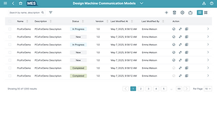

Operational Flow List
Communication Flow List
Message Flow List
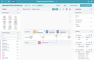
Operational Flow Editor

Communication Flow Editor

Message Flow Editor
-
Design a Role-adaptive Navigation System
Exploring multiple entry points into the system—including the project overview, flow list, title dropdown menu, and side navigation—helped identify the most intuitive and useful pathways. Based on this, I selected and standardized the most effective options to ensure consistency across the experience, allowing users to easily re-orient themselves and navigate seamlessly regardless of where they enter the workflow.

Design Exploration
Navigate from flow list
Navigate from project

Navigate from title menu

Navigate from side navigation bar
Design Decision
I prioritized navigation from the project view as the primary entry point, since it serves as a unified space where all flows and machines are visible across roles. In addition, I supported access from the flow list to enable more flexible workflows, allowing users to create and manage flows independently without needing to enter a project context.
Between navigation patterns, I chose a side navigation over a title dropdown menu, as it provides better visibility, quicker access, and clearer orientation within a complex system. This reduces hidden interactions and makes it easier for users to understand where they are and move between different parts of the workflow.
-
Introduce Progressive Disclosure for Complexity
With consistent layouts and navigation patterns in place, I then addressed differences across roles by introducing progressive disclosure. This ensures users only see the level of information relevant to their tasks—routing planners focus on high-level structures and relationships, operational planners work with expanded steps and connections, and technical engineers access detailed machine and message parameters on demand. This approach reduces cognitive overload while still preserving access to deeper system complexity when needed.

High-level routings
Expanded steps and connections

Detailed machine/message configuration
-
Enable Contextual Drill-down and Drill-up
Now that users can view information relevant to their specific roles, I also needed to ensure they could easily navigate across different levels of detail for reference without losing context. To address this, I introduced cognitive drill-down and drill-up interactions, allowing users to seamlessly move between high-level routing views and detailed operational or machine-level logic. This reduces mental effort while improving visibility and maintaining a unified understanding of the entire system.
Design Exploration

Drill via direct item click

Drill via breadcrumb

Drill via item hover
Drill via item's contextual menu
Design Decision
After exploring multiple interaction patterns—including drill-down via item hover, contextual menus, breadcrumb navigation, and direct item click—we finalized a hybrid approach combining item click and breadcrumb navigation as the primary system. Users drill down by clicking on items, while breadcrumb links enable clear drill-up across hierarchy levels, which was found to be the most intuitive and predictable navigation model.
Hover and right-click contextual menus were also considered as alternative entry points for drill-up/down actions, but were ultimately not selected as primary patterns. Based on user feedback, these interactions were less discoverable and added unnecessary interaction complexity, making the hierarchy harder to understand and increasing cognitive load in a system that already deals with layered information.
Final choice: direct item click + breadcrumb
Core Challenge
Rapid Response to Runtime Failures in Layered Production Systems

Key Insight
Users struggle to quickly trace and understand failures across fragmented production layers, as error information is split between routing, operational, and machine-level views. This slows diagnosis and response, especially in time-sensitive situations, and requires constant context switching to understand system impact.
-
Provide Immediate Failure Feedback and Actionable Guidance
I addressed this challenge by first identifying two critical failure scenarios: project activation failure and deployment failure to the shop floor. Based on these edge cases, I defined clear failure states and behaviors across the system. When failures occur, a contextual modal surfaces the issue with actionable guidance, while affected elements are highlighted within the project view. This allows users to quickly locate and resolve straightforward issues without navigating away or losing context.
Edge case 1. Project activation fails
Missing or incomplete configurations
→ Show a consolidated validation message outlining all blocking issues, such as missing flows, unlinked relationships, or incomplete parameters. Highlight affected elements and provide deep links to the relevant flows for quick fixes.
Unlinked or incorrectly connected flows
→ Indicate which operational, communication, or message flows are not properly connected. Guide users to resolve linkage issues before activation.
System response
→ Set the project status to Blocked and disable activation until all issues are resolved. Once fixed, allow users to update the status and proceed with activation.
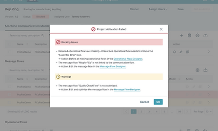
Modal with detailed guidance

Highlights within the project detail
Edge Case 2. Deployment to shop floor fails
Network or system failure during deployment
→ Show a clear error state indicating deployment failure, including network issues or PCo/MES system errors, with the last known deployment attempt status.
Configuration or parameter issues
→ Highlight incorrect or missing parameters and connection issues, and guide users to fix them at the flow level before retrying deployment.
System-level failure (e.g. MES/PCo errors)
→ Provide a retry option and surface system status, with guidance to contact admin if the issue persists.
Project state handling
→ Set project status to Deployment Failed and prevent further deployment actions until issues are resolved. Once resolved, allow reactivation and redeployment.

Toast message when deploying failed
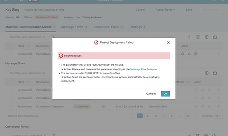
Modal with detailed guidance
-
Introduce Persistent Contextual Error Panels
To reduce reliance on temporary modals, I explored different error panel layouts and introduced a persistent error panel that surfaces detailed information, related nodes, and quick actions. This supports continuous debugging workflows and allows users to investigate issues without interrupting their task flow.
Design Exploration
Bottom drawer
Split view
Side panel
Inline banner
Design Decision
After exploring four persistent error panel layouts—side panel, inline banner, bottom drawer, and split view—I chose the side panel as the primary solution. It provides a consistent and non-intrusive space for displaying detailed error information while keeping the main workflow visible and uninterrupted. Compared to inline banners or bottom drawers, the side panel offers better support for complex debugging tasks, allowing users to review related nodes, trace issues, and execute quick actions without losing context.
-
Build a System-Level Error Visibility Layer
Building on the immediate error guidance, I also addressed project-wide errors by introducing a hierarchy view accessible from the side navigation, where users can monitor all flows within a project with clear error indicators. This ensures users have a constant overview of all project-level issues, regardless of their current context, improving traceability and reducing the need to navigate across multiple views to locate problems.
-
Enable Cross-Layer Error Traceability
To support deeper diagnosis, I explored different layouts for visualizing flow dependencies to better surface relationships between flows. By revealing upstream and downstream connections, users can more easily understand the root cause and impact of failures without manually piecing together information from multiple views.
Design Exploration
Dependency view from navigation bar
Dependency view from tool bar

Dependency view via breadcrumb
Design Decision
After exploring three approaches—dependency view from the navigation bar, from the toolbar, and embedding relationships in the breadcrumb—I chose to surface the dependency view through the toolbar. Since upstream and downstream tracing is tied to the current flow, placing it at the flow level makes the interaction more contextual and intuitive.
The navigation bar was not selected as it is primarily reserved for system-level actions, making it less suitable for flow-specific analysis. The breadcrumb approach was also deprioritized due to limited space and its inability to represent multiple upstream and downstream relationships at once, which is essential for understanding complex dependencies.
Deliver
How the final system design came together
UI Design
-
Design Specifications
At this stage, we established the visual foundation for the high-fidelity wireframes. We began by defining the layout anatomy, spacing system, and design tokens to ensure visual consistency and clear hierarchy. From there, we developed the core component library, including buttons, cards, modal templates, and icon sets.


-
High-Fidelity
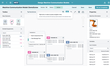
The final design showcases draggable flow editors with drill-up and drill-down navigation, enabling users to manage the entire production process in one place and seamlessly deploy configurations to machine level.
1
Visual Flow, Zero Code
Transforms complex coding and logic into intuitive visual workflows.
2
See the Big Picture, Dive into Details
Introduces hierarchical navigation that allows users to easily drill up or down between different levels of flows and machines.
3
A Single Source of Truth
Unifies multi-system data into a single model and visual hierarchy for cross-role collaboration.
Impact & Learnings
From fragmentation to a connected experience
The MVP of Central Design Time (CDT) was released as a beta to a group of key customers, marking an important step in validating its end-to-end approach to production design. As a cloud-based solution, CDT enables users to build holistic production models while integrating seamlessly with ERP and MES systems. The beta received strong positive feedback, with additional customers requesting access, and users demonstrating higher engagement and improved success rates in completing production workflows—validating the system’s ability to simplify complex interactions into a more intuitive, connected experience.
Beyond these outcomes, the project revealed how deeply fragmented production systems can be unified through thoughtful information architecture and interaction design. It showed that designing for complexity is not about reducing functionality, but about structuring information, workflows, and relationships in a way that aligns with how the system actually operates—making it easier for users to navigate, understand, and act across different layers.
Personally, this project strengthened my interest in information architecture, flow design, and interaction design within complex systems. I particularly enjoyed exploring multiple solution directions and refining how information hierarchy and navigation patterns can reduce cognitive load while preserving system depth. It also deepened my ability to think across interconnected workflows and design with both user needs and system constraints in mind.


Disclaimer: The visuals in this case study are recreated simulations designed to demonstrate the design process and key improvements. Due to confidentiality agreements, no original content from the live product is shown.