Overview
At SAP, we partnered with the Chinese Academy of Sciences to build an Industry 4.0 demonstration system using customizable model car assembly, simulating the end-to-end manufacturing lifecycle from order to delivery.
Role
-
UX/UI Designer
-
Web Developer
Team
Design Team, MES Team, ERP Team, MII Team, PCo Team
Tools
Figma, FigJam, Miro, Adobe Creative Suite, Jira
Details
-
Duration: 5 months
-
Company: SAP
My Role
-
Defined information architecture, user flows, and swimlane diagrams to structure complex manufacturing processes into scalable experiences.
-
Improved interaction design by resolving hierarchy and flow issues, enhancing clarity and decision-making.
-
Bridged design and engineering by translating UX requirements into feasible solutions and aligning implementation with intent.
Showcase Outcome
So what did we achieve
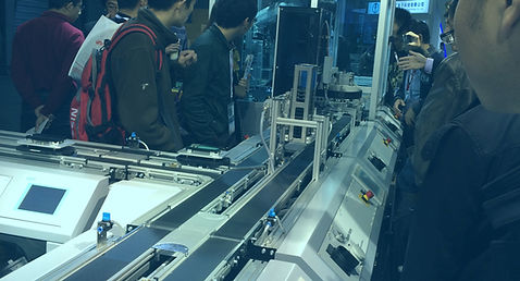
Presented at China International Industry Fair in collaboration with Chinese Academy of Sciences, the Smart Manufacturing demonstration line attracted strong engagement from industry visitors. The interactive experience enabled attendees to explore the end-to-end workflow—from vehicle customization to intelligent production.


Discover
Let’s go back to how it all started
Background
Building on their respective research strengths, SAP and the Chinese Academy of Sciences partnered to develop an intelligent manufacturing demonstration line grounded in Industry 4.0 principles. Using the assembly of customizable model cars as a representative scenario—where customers can freely select vehicle models, colors, and configurations—the project simulates the complete lifecycle from order placement to production and delivery.
Note: Our focus was on the e-commerce platform and production control experience, while ERP maintenance and system integration were managed by separate teams. The development of the reconfigurable, modular intelligent automation system, as well as the full interconnection of equipment, personnel, and materials, was led by the Chinese Academy of Sciences.
Target User
To understand the real challenges across vehicle customization and production execution, we interviewed customers, supervisors, and shopfloor operators, while exploring SAP’s existing platforms as a starting point. This revealed that inefficiencies weren’t isolated—they spanned the entire journey, from configuration to execution.

Goal
Seamlessly customize and track their model car orders from selection to delivery.

Goal
Oversee the production line to ensure efficiency and timely fulfillment of orders.
Goal
Monitor and manage machines and processes to keep production running smoothly.
Pain Points
We mapped insights through affinity diagrams, personas, and user journeys to uncover deeper patterns. This showed us where breakdowns consistently occurred and where opportunities for improvement existed.
Customer
-
Inefficient interaction flow
-
Lack of transparency and clarity
-
No progress saving or tracking
-
Insufficient guidance during configuration
Supervisor
-
Lack of clear prioritization
-
Disconnected data and unclear impact
-
Limited support for troubleshooting and collaboration
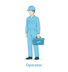
Operator
-
Poor usability in real shopfloor conditions
-
Lack of clear prioritization
-
Limited support for troubleshooting
Define
This is what we uncovered
After synthesizing insights from user interviews and business research, we identified recurring breakdowns across customers, supervisors, and operators.

Key Insight
Users struggle with fragmented workflows, unclear information hierarchy, and limited system guidance, making it difficult to efficiently configure, monitor, and act on complex manufacturing processes.
In addition, operational users lack clear prioritization and contextual insights, reducing decision speed and effectiveness on the shopfloor.

Design Decision
So we decided to focus on clarifying information hierarchy, streamlining key flows, and introducing better guidance and visibility to support faster, more confident decision-making.
Project Goals
-
Vehicle Customization & Ordering Platform (Customers)
Goal 1
Create an interactive editor that guides customers through compatible options and real-time previews
Goal 2
Build an order tracking process that clearly communicates progress, notifications, and support options
Goal 3
Introduce a rule-based recommendation engine that suggests optimal vehicle configurations
-
Intelligent Production Management System (Supervisors and Operators)
Goal 1
Design a prioritized production dashboard that lets operators identify critical issues within seconds
Goal 3
Provide structured tools for operators and supervisors to document shift notes, escalate context-rich handovers, and maintain continuity of production insights across teams
Goal 2
Build a touch-friendly, high-contrast interface optimized for real operational conditions
Goal 4
Provide step-by-step troubleshooting guidance for common production issues, helping operators resolve alerts faster with standardized resolution paths and embedded SOP references
MVP Goals
Design Decision
Due to the industry fair deadlines, and limited engineering availability, we prioritized MVP features that directly support core user workflows.
For Vehicle Customization & Ordering Platform, We focused the MVP on enabling users to confidently configure and order vehicles.
Goal 3 were deprioritized due to their complexity and reliance on additional data and logic, while not being essential to completing the core flow.
For Intelligent Production Management System, We prioritized real-time visibility and issue detection to support quick decision-making on the shop floor.
Goal 3 and Goal 4 were deferred, as they depend on process alignment and are not critical for initial system usability.
Note: To keep the case study focused and clear, I concentrated on the Intelligent Production Management System from here due to its higher complexity, developing detailed current and future workflows, refining the information architecture, and designing interaction patterns to support efficient, high-pressure decision-making. The Vehicle Customization & Ordering Platform is presented more succinctly, as it leveraged similar process insights and design principles.
Design
So we started shaping the solution
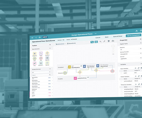
Information Architecture & Workflow Design
-
Sitemap
Now that we’ve defined the goals for the Production Management System, we translated them into two simple scenarios—one for a supervisor and one for an operator—to ground the design in real usage contexts.
-
Scenario 1: A supervisor monitors overall production health -> detects a critical alert -> assesses machines and production impact -> initiates work orders as needed
-
Scenario 2: An operator reviews the machine status dashboard -> checks newly assigned work orders -> drills into related context to identify issues -> performs corrective actions to fix problems -> marks work orders as complete
From there, we gathered insights from similar platforms, along with input from end users and business stakeholders, to understand what information truly matters in these scenarios. Then we decided to structure and validate these through a sitemap, ensuring the system surfaces the right data at the right time.

-
User Flow
From there, I developed role-specific user flows to optimize each experience within the larger system, ensuring that supervisors and operators can efficiently complete their key tasks with minimal friction.

Case 1: The supervisor monitors overall production and initiates work orders as needed

Case 2: The operator monitors related machines and fixes work orders as needed
Core Challenge
Signal Overload Without Action Hierarchy

Key Insight
In high-pressure factory environments, users are exposed to multiple competing signals, but critical issues were not clearly prioritized, making it difficult to identify what required immediate action. This revealed that the core challenge was prioritization, not data availability.
-
Understanding the Core Information Needs
I took charge of addressing this roadblock by first exploring what core information a production overview dashboard should present. I designed multiple supervisor dashboard variations tailored to different focus areas such as quality, equipment, workforce, and production. These concepts were then presented to stakeholders to gather feedback and align on which perspectives best supported our showcase.

Design Exploration

Workforce focused

Overview focused

Quality focused

Production focused

Machines focused
Design Decision
I initially explored the idea of using a dropdown to switch between different dashboard views. However, this introduced additional complexity in interaction design and cognitive load. We ultimately selected a single overview dashboard, which surfaces the most critical information supervisors need at a glance to support fast and informed decision-making.
-
Shaping the Information Hierarchy
Now that the dashboard content is defined, I designed the information hierarchy to guide the user’s attention toward the most critical information first, followed by secondary and tertiary details.
This was achieved through a clear set of hierarchy strategies that align with users’ common behavioral flow—supporting how they naturally scan, prioritize, and act on information—enabling fast scanning and more efficient decision-making.

-
Resolving Visual Competition in Critical Alerts
During the design process, I faced a challenge in emphasizing the Alerts card while balancing the dashboard’s overall clarity and contextual relationships. Alerts are actionable signals, so they require prominent visibility—but I also needed to consider related information and the limited screen real estate.
I explored several approaches: Alert-focused placement, Top-of-dashboard alert banner, Floating alert badge, Expandable alert drawer, and Enhanced contextual alert card.
Design Exploration
Alert-focused

Alert banner

Floating alert badge

Alert drawer

Floating alert badge

Enhanced alert card
Design Decision
We ultimately chose to enhance the existing alert card within its contextual area. This approach preserves the relationship between alerts and related entities (work orders, production orders, and machines), avoids additional space consumption, and minimizes interaction cost by keeping information immediately visible. It also maintains a balanced hierarchy by using subtle visual emphasis rather than introducing separate or duplicative components.
-
Designing for Clarity at Different Levels of Detail
I further enhanced the design by implementing progressive disclosure, keeping the overview context visible while supporting fast scanning and quick access to targeted details. This approach also minimizes navigation disruption by revealing information only when needed, reducing cognitive load and maintaining workflow continuity.
A progressive disclosure flow: quick inspection in a drawer, with an option to dive into full alert details
Core Challenge
Inconsistent Context Undermining User Trust

Key Insight
Even with a clear information hierarchy, users still struggled to trust the system when statuses were missing, delayed, or inconsistent across objects. The issue was not just structure, but real-time reliability and interpretability.
-
Managing User-Triggered Exceptions
I started by designing multiple fallback strategies to handle or prevent unexpected user issues, including safeguards against accidental actions, autosave with undo functionality, role-based permissions, and inline error guidance.
Safeguards against accidental actions
Autosave with undo functionality

Role-based permissions
-
Mitigating System-Driven Failures
After addressing user-triggered issues, the focus shifted to system-triggered scenarios.
Taking the supervisor’s user flow as an example, I mapped out key interactions to identify where unexpected cases were most likely to occur—especially at points where system behavior could become unclear or inconsistent.

Updated supervisor flow with edge cases
After refining the user flows, four key edge cases emerged where the system could fail to behave as expected during real operations. These included missing data, conflicting data sources, disabled actions due to system constraints, and failure to save a work order.
This led to defining corresponding system actions for each critical touchpoint, enabling the system to anticipate disruptions, mitigate issues, and guide supervisors more reliably through system-triggered failures.
I will take missing data in the dashboard and failure to save a work order as examples to further illustrate how these edge cases were addressed.
Edge case 1. Missing data in dashboard
No machine access
→ Show access restriction message, explain reason, and provide link to settings or admin contact. Preserve last known state if available.
Data source disconnected (OPC UA / SCADA / MES)
→ Display connection status, last update time, and a clear explanation. Show auto-retry or reconnecting state.
Network latency / sync issues
→ Indicate delayed or partial data with freshness timestamp. Keep last known data visible and show syncing status.
No active production orders
→ Show empty state with explanation and link to production order list, while maintaining overall dashboard context.

Designing graceful degradation for missing dashboard data
Edge case 4. Fail-to-Save Work Order
Network or system error during save
→ Show error message, keep user input, and offer retry option.
Duplicate work order detected
→ Alert user, link to existing record, and prevent duplicate creation.
Unexpected server or database issue
→ Show general error message, allow retry, preserve input, and provide support contact.
Designing resilient save flows for network or system errors
-
Standardizing System States for Clarity
Understanding how to handle unexpected cases is not enough. In a real-time production environment, user trust also depend on clear and predictable system feedback. Therefore, I defined explicit state changes across components, alerts, and system statuses to ensure consistency, clearly communicate data freshness, and support faster, more confident decision-making.

Standardizing state changes

System State Visibility in Dashboard Design

System State Visibility in Master-Detail Design
-
Connecting Status to System Impact
Key Insight
Even when system errors are clearly indicated, users still struggle to act confidently when they lack understanding of how issues affect upstream or downstream processes.
This led to a clearer understanding that the core issue was not only the presence of error messages, but whether users could interpret the scale and impact of those issues in context.
Design Decision
I added related context metrics to each data model so that when an issue occurs, the system shifts from simply indicating “something is wrong” to “here’s how big the problem is”.

Value of upstream/downstream context for decision-making
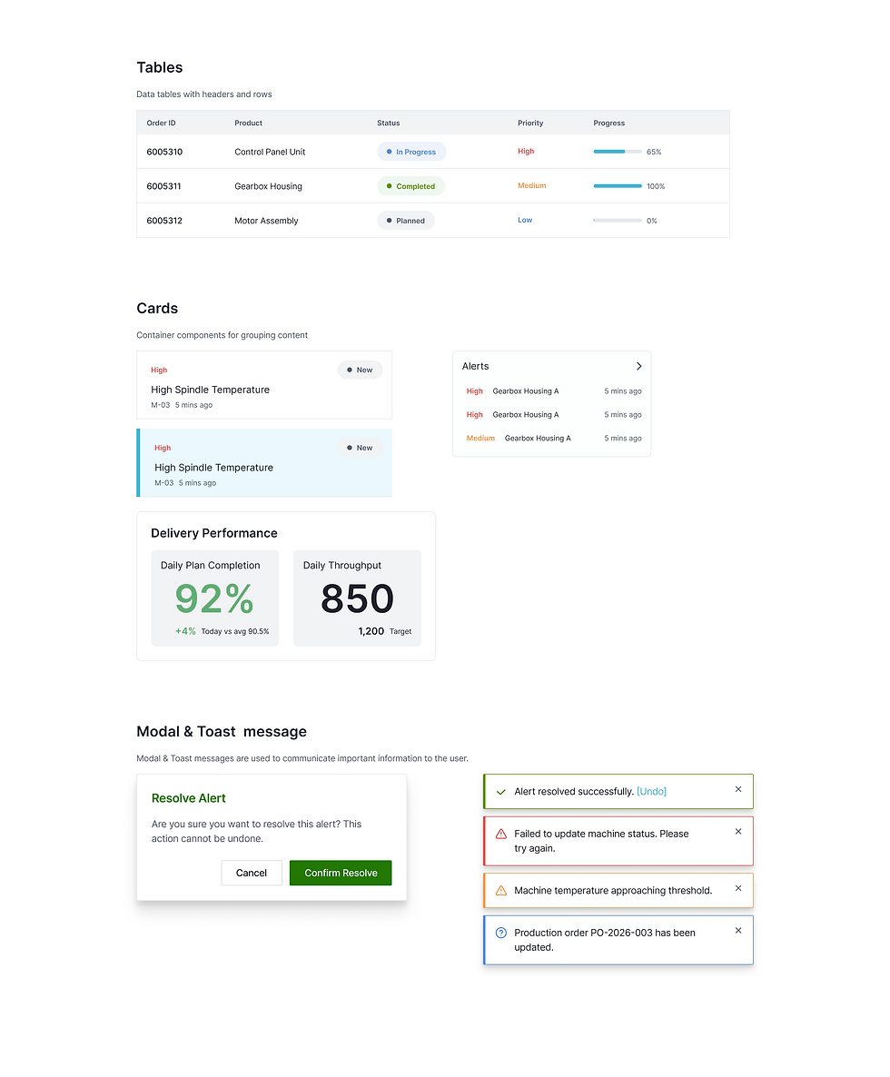
Design System
After defining the system structure, we iterated through progressive fidelity to validate layout hierarchy, interaction patterns, and edge-case behavior before moving into final UI design.
To ensure consistency across complex dashboards and reduce ambiguity in layout and hierarchy, we defined a scalable design system based on a 12-column grid with 24px spacing rules for margins and gutters.
This system established a unified structure for layout, spacing, and components—supporting clearer information hierarchy while enabling faster and more consistent design and development workflows.


Hover to slide through
Deliver
Here's how it came together
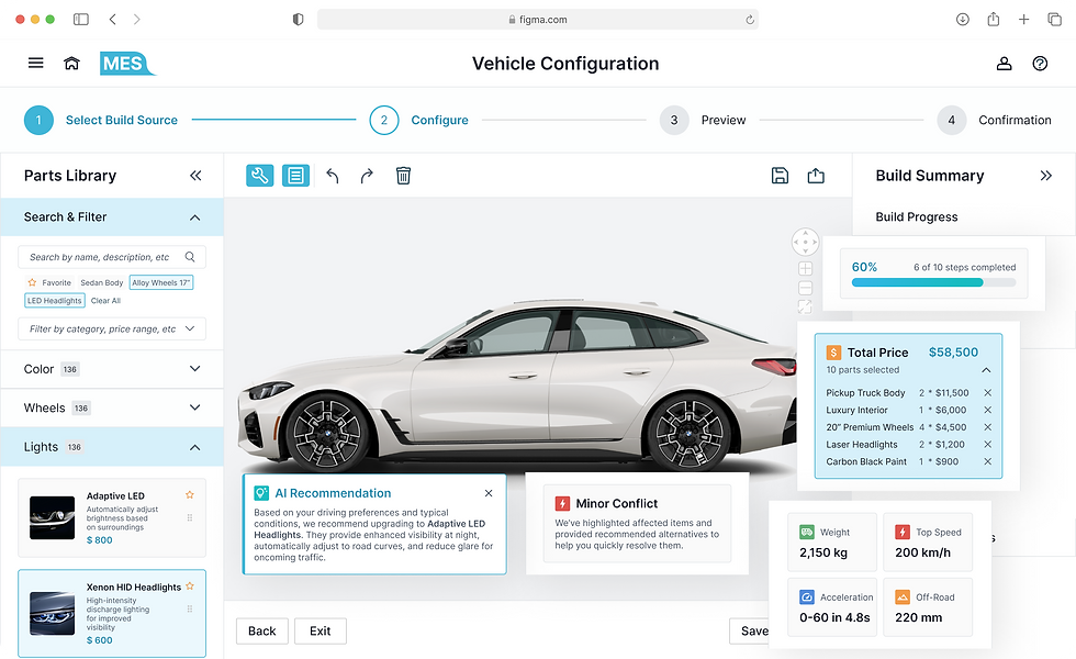
Vehicle Customization & Ordering Platform
We designed mockups for the first stage of the Smart Manufacturing demonstration showcase—a Vehicle Customization & Ordering Platform for customers. The interface guides users through configuring vehicle options and placing orders, providing clarity and confidence while highlighting the beginning of the end-to-end smart manufacturing experience.


Hover to slide through
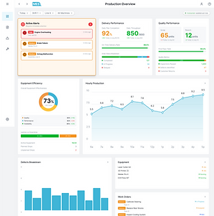
Intelligent Production Management System
We created mockups for the Intelligent Production Management System, designed for supervisors and operators as part of the full Smart Manufacturing demonstration showcase. The interface provides real-time visibility into production status, highlights critical issues instantly, and supports efficient decision-making, illustrating the end-to-end capabilities of the smart manufacturing workflow.
Act Fast, Stay in Control
Supervisors instantly spot critical issues and take action with clear priorities, real-time alerts, and minimal cognitive load.
See the Full Picture, Decide with Confidence
Supervisors dive into connected data and production context to understand root causes and make informed, end-to-end decisions.
Know What Matters, Do It Right
Operators access the right context at the right time—machine status, instructions, and alerts—so they can act confidently and accurately on the floor.
Design–Engineering Alignment
With a background in software engineering, I worked closely with developers to balance interaction quality with implementation complexity in the Component Snap & Auto-Alignment feature.
The original design enabled users to drag and snap parts directly onto the canvas with real-time visual feedback, but this raised concerns around performance, edge cases, and cross-platform consistency.
While an alternative click-to-replace approach was proposed for simplicity, I advocated for preserving direct manipulation due to its intuitive, spatial feedback.
We explored implementation within SAPUI5 and structured the parts palette using a tree-based data model to support efficient drag operations and feedback states.
As a result, we delivered a hybrid solution: full drag-and-snap interactions in modern environments, with a simplified fallback for older browsers and accessibility needs—maintaining usability without compromising system stability.

Impact & Learnings
From system complexity to real-world clarity
The system was successfully showcased at the China International Industry Fair, where industry visitors engaged with the full workflow—from vehicle customization to intelligent production—demonstrating its clarity and real-world applicability.
Beyond the demonstration itself, this project revealed how fragmented manufacturing logic can be transformed into a coherent, navigable experience when design decisions are tightly aligned with system behavior and engineering constraints. It showed that clarity in complex systems is not achieved by simplification alone, but by structuring information and interactions in a way that reflects how the system actually works—making it understandable, operable, and scalable in real use.
It reinforced my passion for information architecture and interaction design, and deepened my understanding of designing interconnected systems independently while keeping the broader ecosystem in mind. It also shaped how I think about real-world design communication—especially through presenting the system live, where I learned how to translate design decisions into clear narratives, respond to on-site questions, and connect more directly with users and stakeholders.


Disclaimer: The visuals in this case study are recreated simulations designed to demonstrate the design process and key improvements. Due to confidentiality agreements, no original content from the live product is shown.